
Woodland Mills


The Challenge
Woodland Mills’ “Build and Price” tool was a powerful sales asset—but it had become increasingly difficult for customers to navigate. Originally created as a stopgap to help customers calculate pricing, taxes, and shipping estimates, the tool lacked a clear visual hierarchy, offered no product imagery, and buried critical CTAs deep below dual-scroll containers.
Customer frustration was mounting. Internal teams were fielding constant quote corrections due to misconfigured carts, and support staff were manually following up with confused users. Even heatmap data showed a troubling pattern: users weren’t even seeing our calls to action—let alone using them.
This project coincided with a broader rebrand of Woodland Mills, offering a key opportunity: to reimagine Build and Price not just as a calculator, but as a seamless, trustworthy, and visually guided product experience.
Discovery & Research
We kicked off with a thorough audit of the existing tool. Working alongside internal stakeholders and developers, we analyzed behavioral data, captured feedback from support staff, and spoke directly with customers.
Key Issues Identified:
- Multiple scrollable areas creating friction and confusion
- Accordion-style list design overwhelmed users with too much info at once
- CTA buttons buried in second scroll layer, invisible on desktop
- No visual representation of selected products or configurations
- High volume of incorrect quotes requiring manual follow-up
Customer Sentiment Highlights:
“Unintuitive.”
“I couldn’t submit a quote.”
“Parts weren’t compatible, and I didn’t know until support told me.”
Defining the Vision
With usability and clarity top of mind, we set out to reimagine the tool with three goals:
- Guide customers clearly through the configuration process
- Validate compatibility at each step to reduce manual quote errors
- Provide visual context so users could understand what they were building
We mapped this vision against the needs of our key persona:
Meet Jack Sawyer
A 42-year-old small-scale farmer and woodworker from rural Oregon. Jack is looking to expand his woodworking into a business and needs a tool that helps him understand what he’s buying—without confusion or second-guessing. His time is valuable, and trust in the quote process is essential.
UX Approach & Solution
We rebuilt the experience from the ground up—starting with a modular framework that would scale with Woodland Mills’ product line and new brand language.
Core UX Improvements:
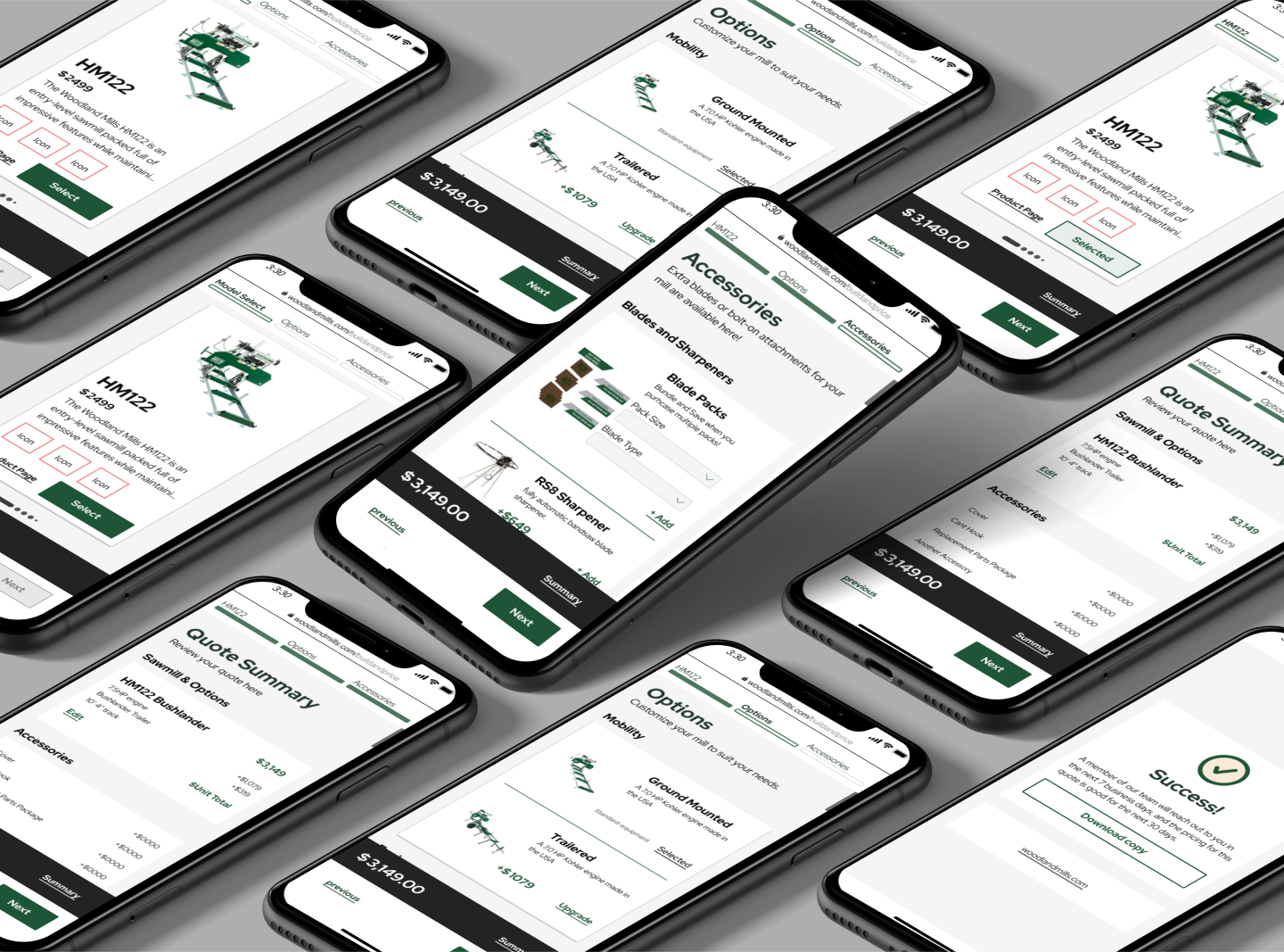
Pagination-Based Flow
We moved away from a single-page layout to a multi-step experience. Each phase of the build now focuses on one task—selecting, validating, and customizing a mill—before moving to the next.
Visual Product Preview
We introduced imagery and a potential 3D configurator to help customers understand exactly what they were building. This reduced friction and supported more confident decision-making.
Smart Filtering & Compatibility
Users are now only shown compatible accessories based on their prior selections—eliminating cart errors and ensuring cleaner quote generation.
Early Zip Code Capture
By asking for a postal code early in the flow, we could automatically calculate shipping and tax, eliminating the guesswork that had previously led to quote corrections.
Clear CTA Placement
CTAs are now persistently visible, ensuring users always know how to proceed or save their configuration. No more hidden buttons or accidental drop-offs.
Feature Highlights
- Guided “Find Your Mill” quiz for new users
- Email sign-up + optional save-for-later functionality
- Clean side-by-side part compatibility validation
- Structured developer handoff through high-fidelity prototyping
- Scalable interaction models for future expansion
Reflections & Takeaways
The original Build and Price tool filled a gap—but the rebuild helped transform it into a strategic asset. With improved clarity, reduced support costs, and a stronger customer-facing experience, Woodland Mills now has a lead-gen platform built for scale.
Key Lessons:
- Visual hierarchy is everything when guiding customers through complex configurations
- Compatibility feedback loops reduce operational risk
- Trust is built not just through branding—but through a seamless, supportive interface
Check other
Projects


A closer look at my time with the Canadian exercise equipment company as their UI/UX specialist
